Natasha Savicheva
Can a design language ever be truly universal?
What is a universal thing? It could be said, a simple bowl is one. Everyone understands a concept of a bowl: you put things in it, that otherwise cannot be held together. But what if you need to communicate a bowl? Every little nuance of it is important: its colour, pattern, background, content. There are many options.
By the end of the eighteenth century, the quantity of information and images had grown almost out of control and it became clear that there needed to be a specific profession to take control of all this material.
— Roger R. Remington
— Roger R. Remington
So, there is a need to control visual information, but the problem is: nobody knows exactly how. People were looking for universal design approach: modern industrial designers of the early 20th century wanted to establish standards and ideals (as an example - Bauhaus school oriented on creating products which would be affordable and easy in mass production). Postmodernity, meanwhile, tried to tailor visuals appropriate for the specific matter (such as Jamie Reid, creator of punk posters and covers targeted on underground community).
Both approaches have their advantages and disadvantages. Modernism seemed too boring and inexpressive for the masses. Postmodernism, as opposed, lacked the order and clarity. So the absolutely universal design language hasn’t ever been invented.
Both approaches have their advantages and disadvantages. Modernism seemed too boring and inexpressive for the masses. Postmodernism, as opposed, lacked the order and clarity. So the absolutely universal design language hasn’t ever been invented.
The rise of functionalism
In the early 20th century, Industrial revolution made designers think of standardization and unification. The decorating was substituted with practical thinking. In 1923, Bauhaus’s furniture workshop was following a principle of functionalism:
The starting point for the chair was the problem of creating a comfortable seat and combining it with simple design. This total rejection of art as an explanation for form reflected Bauhaus ideology of the time, whereby art was to be absorbed into handicraft and engineering. The word ‘Art’ was to deleted from the dictionary.
The group of artists De Stijl was simplifying art in a similar way:
[i]“They believed art should reconcile the great polarities of life - ‘Nature and the intellect, in other words the female and male principles, the negative and the positive. The right angle and the three primary colours, supplemented by black, white, and grey, composed the basic elements of expression. With the means of artistic creation thus specified, it would be possible to overcome the ‘supremacy of the individual’ and create ‘collectivist solutions’”[/i].
- Droste, M., Bauhaus 1919-1933
That was strictly pragmatic kind of art, the kind which wants to construct meanings rather than invent them from scratch.
Swiss designers attempted to make the graphic design objective (applying the grid, typefaces of high readability and minimalist pictograms). The works of Siegfried Odermatt, swiss advertising designer, illustrate the difference between the advertising ideas in New York and Zurich:
The swiss advertisements looked like the work of designers rather than art directors. They rarely depended on a single headline; the largest type was the name of a product; the image derived directly from the product rather than illustrating a marketing concept.
[i]The highest praise for a piece of graphic design was: ’This is very clean.’ We saw ourselves as sweeping away the clutter and confusion of American advertising design with a professional rationality and objectivity that would define
a new American design.[/i]
— Catharine McCoy about studying on Massimo Vignelli's course
a new American design.[/i]
— Catharine McCoy about studying on Massimo Vignelli's course
Massimo Vignelli and his work
These examples illustrate how designers tried to create universal visual language through simplification and functional approach. They thought, simple thing will always be perceived in a same way. But as the times went by, the perception has changed, and what was created as universal, has got a label on it as well.
“Even in embracing the most irreducible of geometric forms, designers of the twentieth century created distinctive and identifiable forms that can be placed in history and associated with particular aspects of modern culture.”
- Davis, M. Graphic design Theory
- Davis, M. Graphic design Theory
The strict simplicity ended up being just another style among many other possible styles, while the surplus of practical thinking and the lack of artistic madness raised some sort of rebellion among graphic designers.
Making Choices
A designer always has a choice: he can embrace the position either of a person who “makes it clear” or a person who makes impression.
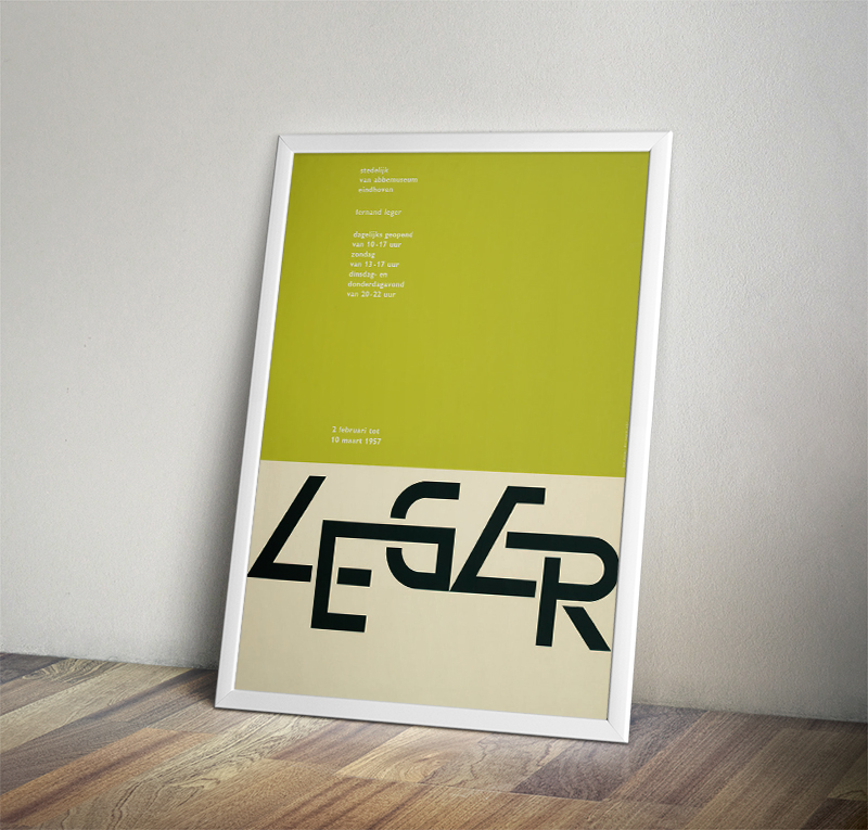
Graphic designer and typographer Wim Crouwel embraced strictly logical and geometrically right approach.
Not only did he use the principle of the grid, but tried to make the rules as elaborate as possible.

As used by the Swiss, the grid helped the designer to organize the rectangular units of typography, but Crouwel made it into the basic matrix within which the letters themselves were constructed.
- Richard Hollis "Graphic design. A Concise History"
- Richard Hollis "Graphic design. A Concise History"

His opponent, graphic designer Jan Van Toorn was dedicated to impression making.
He believed that every person should be an expert of his own experience.
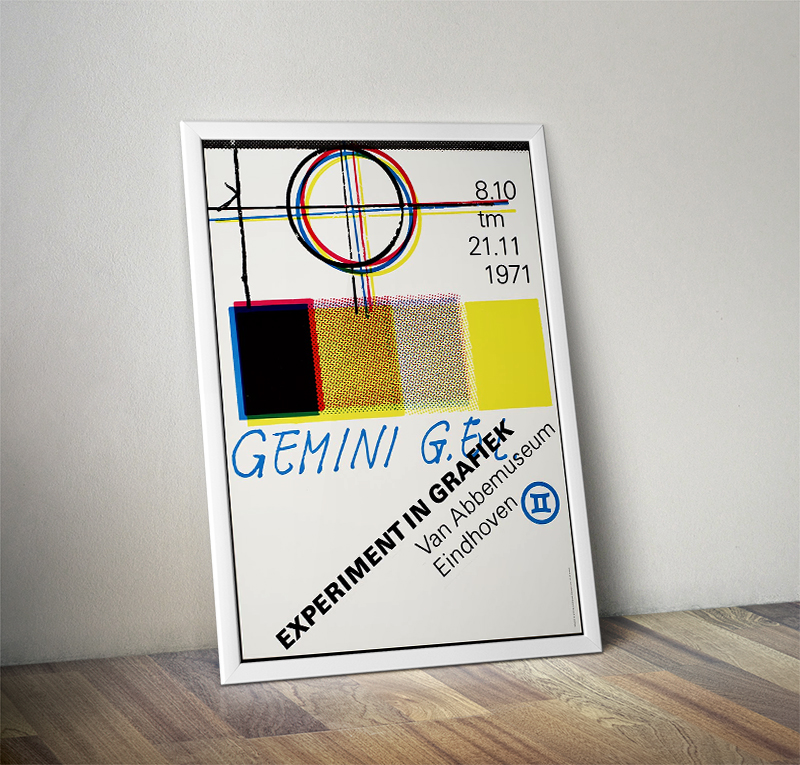
[In Jan Van Toorn's work] the main focus should always be on the receiver, who should be continuously allowed to be the expert of his own experience, his own history.
- Rick Poynor "Jan Van Toorn: Critical Practice"
- Rick Poynor "Jan Van Toorn: Critical Practice"
Senior designers like Crouwel insisted that ‘graphic design is a profession, just like being a doctor’. Others, like Jan Van Toorn, insisted on a designer’s commitment to exposing the relationships of meaning, making each work explain its own context"

Richard Hollis
Graphic design: A Concise History
Postmodernism comes to stay
Postmodernism came along ariund the 1960s, when designers started producing more expressive and vibrant works, relying more on cultural codes and found imagery.
A number of us, mainly graphic designers in the ‘Swiss’ method, began to search for more expressive design, paralleling a similar movement in architecture now known as Post-modernism. This included a new permission to employ historical and vernacular elements, something prohibited by ‘Swiss’ modernism.
After the surplus of practical thinking they were looking for unusual ways of visual expression, rather than clear ones. They were witty and bright, used double-meanings, recycled images, and created the visuals which middle-class people liked best.
[i][/i]
[i]“the art critic Hughes-Stanton welcomes postmodernism, not as a rejection of modern design, but as a logical step in its development. ‘As an attitude, it is closer to people and what they want: it is prepared to meet all their legitimate needs without moralising what those needs should be.’”[/i] - Rick Poynor, No More Rules: Graphic Design and Postmodernism.
And so the whole new approach was born: the kind of design that does not want to change the society, but instead takes on the shape of what this society wants.
Deconstruction method
Graphic design as an aspect of subculture, a creative tool by which young people communicate among themselves
A good example of work in this direction is deconstruction method, which uses design as an instrument of subcultural communication.
“Some of the most influential British designers of the late 1970s and early 1980s chose to address audience close to their own concerns. Graphic design was in this fundamental sense an aspect of subculture, a creative tool by which young people communicated among themselves.” (Jameson, F. in ‘Postmodernism and Consumer Society’ in Foster,H. (ed.) , Postmodern Culture, 1985)
The idea liberated many young people to create and spread visual art. Everyone were producing graphics. The self-expression was never so accessible before:
"Posters by band members and friends were Xeroxed, instant-printed or silkscreened in garages and basements, then flyposted on telephone poles and walls. As John Newman notes, these scratchy images, an urban folk art with the sinister edge, reflected a belief that anyone could do it and that any graphic style or level of skill was acceptable.”
- Poynor, R. in No More Rules: Graphic Design and Postmodernism
- Poynor, R. in No More Rules: Graphic Design and Postmodernism
At some point in the late 1970s, decinstruction ceased to be strictly underground. the Cranbrook Academy of Art (Michigan, US) started to work on it in a more scientific way.
“New experiments explored the relationship of text and image and process of reading and seeing, with texts and images meant to be read in detail, their meanings decoded. Students began to deconstruct the dynamics of visual language and understand it as a filter that inescapably manipulates the audience’s response.” (McCoy K. and McCoy M., in Aldersey-Williams H. Cranbrook Design: The New Discourse, 1990)
“New experiments explored the relationship of text and image and process of reading and seeing, with texts and images meant to be read in detail, their meanings decoded. Students began to deconstruct the dynamics of visual language and understand it as a filter that inescapably manipulates the audience’s response.” (McCoy K. and McCoy M., in Aldersey-Williams H. Cranbrook Design: The New Discourse, 1990)

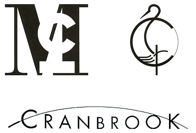
Catharine McCoy's work. Top left: McCoy and McCoy symbol, 1995; top right: Cranbrook Crane symbol, Cranbrook Educational Community, 1994; bottom: Cranbrook logotype
In 1978 the students of the Academy designed ‘French Currents of the Letter’ - an experimental journal, whose first pages looked normal, but the layout was becoming more distorted page by page.
The intention was to highlight the physicality of the printed word’s presentation and to establish new non-linear connections between words, opening the possibility of alternative ways of reading.
Such experimental techniques were commercially used by the London-based studio Why Not Associates and American art director David Carson.
The purpose of deconstruction was explained by designers Ellen Lupton and Abbot Miller:
The purpose of deconstruction was explained by designers Ellen Lupton and Abbot Miller:

We see the production of meaning not as a private matter but as a structured by external codes in language, education, media, and custom within which an individual should operate
- Ellen Lupton and Abbot Miller in "No More Rules: Graphic Design and Postmodernism"
- Ellen Lupton and Abbot Miller in "No More Rules: Graphic Design and Postmodernism"
Anything goes. For certain terms
The route that design society had gone - from decorative arts to functionalism, from functionalism to post-modernism - shows us the variety of possible solutions for design problems. Contemporary designer has a huge kit of different design methods and approaches, every one of which has its advantages and disadvantages but is absolutely useable. It is up to them what they want to use to solve a certain task. Which leads to the conclusion that the universal design language itself does not exist.


Forest Fog
The term "fog" is distinguished from the more generic term "cloud" in that fog is low-lying, and the moisture in the fog is often generated locally.


